
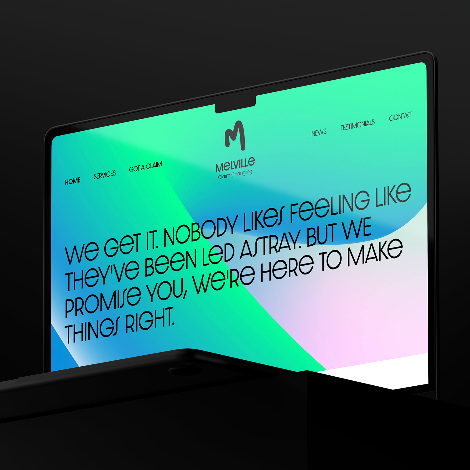
Not often do you get the 'nod of freedom' from a client. Here we did. We knew from our initial audits that the visual landscape that Melville operated in was a touch lackluster. A muted colour here and there and you couldn't move for serif typefaces (not the nice kind either). Given this landscape, some simple yet impactful changes could easily help Melville look and feel a little different from everyone else. We dialed up the intensity on the colours, bled them into one another and slapped a bold, unique wordmarqe into the mix. These quite obvious and brash tweaks really help Melville visually stand out from the proverbial pond life that surrounds them in their industry!

Kind words inbound!

.gif)

